
In January 2026, the HAKRO Merlins celebrate their 40th anniversary. I was tasked with creating a logo that captures this special milestone — and the unique legacy surrounding the club — in a design that works seamlessly across both print and digital media.
The challenge was to develop a fresh and engaging visual identity that harmoniously combines the anniversary year, the sport of basketball, and the magic associated with the HAKRO Merlins.
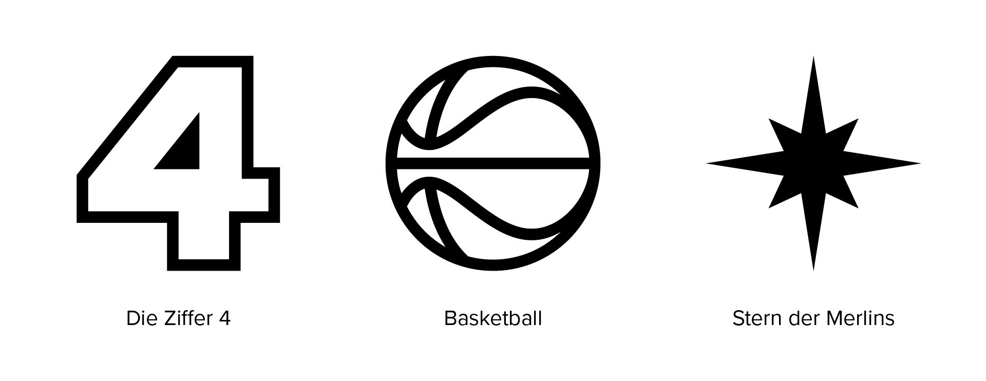
The final concept places the number “40” at the center of the design, with the “0” transformed into a basketball. At first glance, the approach appears classic, but it features a distinctive twist: integrated into the center of the ball is the iconic Merlins star, extending dynamically across the composition. The star symbolizes the club’s journey — rooted in its history while pointing toward a successful future.

Building Blocks
Animation

Application
For the HAKRO Merlins’ 40th anniversary, I produced a short teaser video that was featured across social media platforms as well as on the arena’s LED screens.
As the club was founded in 1986, the visual approach was heavily inspired by the aesthetics of that era. Analog screen distortions, retro-inspired sound design, and a stylized CRT television look transport viewers back to the club’s founding years, creating an authentic and nostalgic atmosphere for the anniversary campaign.
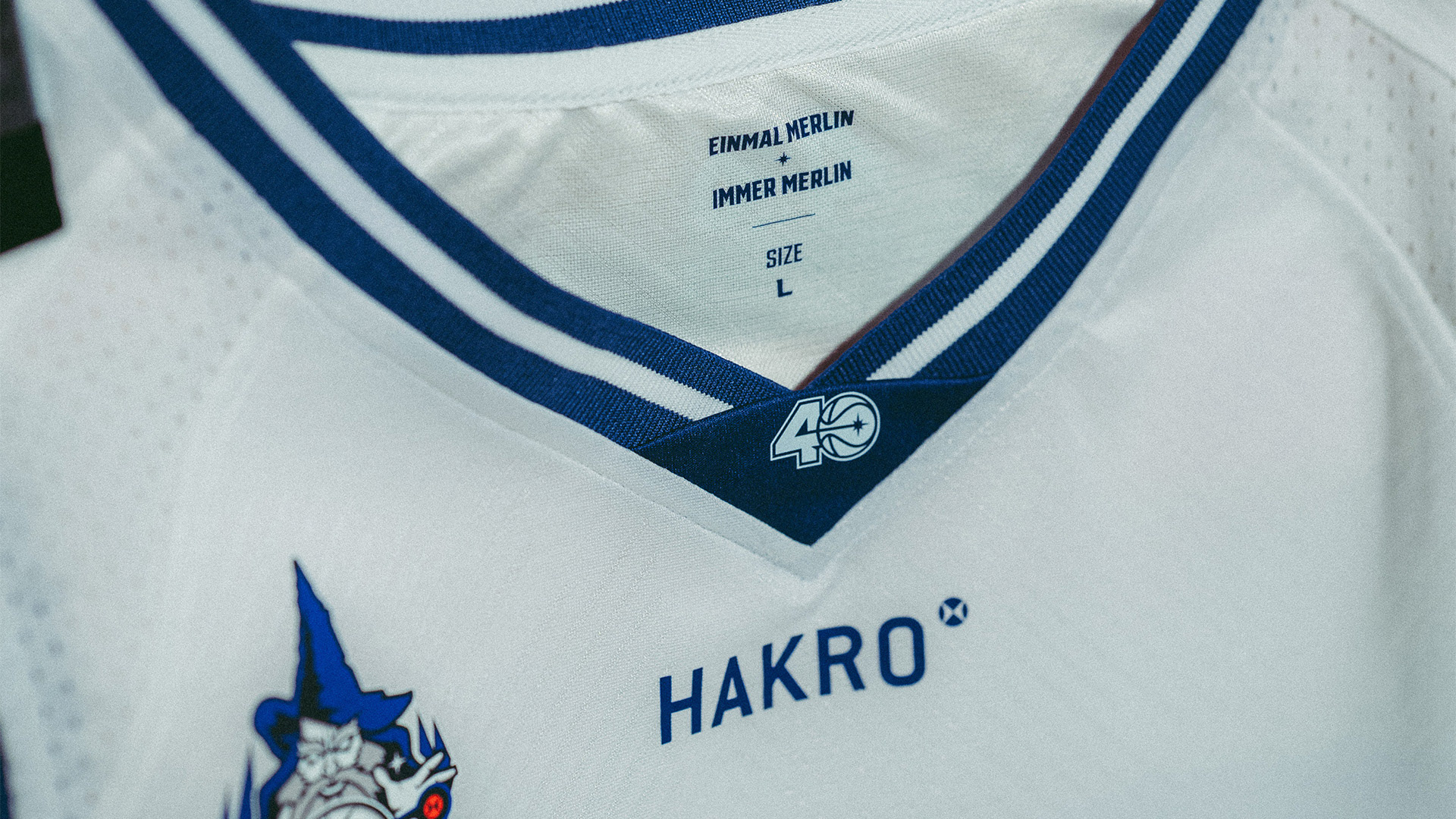
Naturally, the anniversary logo also found its place on this season’s jersey. As a tribute to 40 years of magic and passion, it was positioned prominently on the collar.
In this way, every player and fan carries a piece of Merlins history with pride.